CSS Media Queries and Responsiveness
Responsiveness refers to the ability of your website to resize correctly, and show all the relevant content appropriately on all types of devices, from the smallest, such as the JioPhone, to the largest such as 4K UHD computers.
In order to achieve this, web developers use media queries. This is a type of at-rule that allow us to define certain styles to apply for certain device properties such as a specific width, height, and orientation.
Usually, web developers begin by building the mobile version of a website before scaling it up to tablet versions (and we all collectively wish designers would give us mobile versions first - but wishes are not horses) and finally laptop and desktop versions. This is because it is easier to scale things up than down. Nevertheless, you can also build desktop versions first and then scale them down to mobile devices, but, from experience, it is much harder, and the result might be a bit ugly-looking. That, or I’m just a bad programmer.
You can also use media queries to style how you want a printer to interpret a document before printing it. We are going to look at how to do all that in this module.
The @media rule
We are all wowed about how some websites look so amazing both on phone and on desktop, and we wonder how much time it must have taken the designers and developers to come up with something so amazing.
This is all possible using the @media rule. In the previous module, we brushed over the @media rule because we are going to delve into it in this module.
It has the syntax:
@media (condition) {
    /* Styles you want to apply */
}
The condition above can be one of the following:
min-widthmax-widthorientationscreenprintprefers-color-scheme
min-width
This is used to define an increasing width up to which styles will apply. For example:
@media (min-width: 768px) {
    section {
        background-color: orange;
    }
}
The section will have a background color beginning 768px going upwards. Meaning, beginning tablet-size screens and upwards to laptops and desktops and any other devices with a larger screen will have a background color of orange on the section.
min-width will apply the styles to devices that have a larger width than the one specified. You can think of it as Greater Than.max-width
This is used to define an decreasing width of devices which will have the styles specified applied. For example:
@media (max-width: 767px) {
    section {
        background-color: orange;
    }
}
The section will have a background color beginning 767px going downwards. Meaning, devices that have a smaller with than 767px such as most mobile phones (discounting the flip phones that become tablets) will have a background color of orange applied to the section.
max-width will apply the styles to devices that have a smaller width than the one specified. You can think of it as Less Than.orientation
This defines the styles which you want applied for when the device is either in portrait or landscape mode (when the device width is greater than its height). For example:
/* Landscape mode */
@media (orientation: landscape) {
    section {
        display: flex;
        flex-direction: row;
    }
}

/* Portrait mode */
@media (orientation: portrait) {
    section {
        display: flex;
        flex-direction: column;
    }
}
In the above example, the section will align its elements in row for when the device is in landscape mode, and in column form when the device is in portait mode.
screen
This is used to define screens such as laptops, desktops and smartphones. For example:
@media screen {
    section {
        display: flex;
        flex-direction: column;
    }
}
print
This is used to define how you want your website to look like when it is printed on paper. For example:
@media print {
    body {
        background-color: #ececec,
        color: #333333,
        padding: 32px 24px;
    }
}
prefers-color-scheme
This is used to detect whether the user has set their device theme to light to dark mode, and applies the styles you define appropriately. For example:
/* Styles for light theme */
@media (prefers-color-scheme: light) {
    body {
        background-color: #f1f1f1;
        color: #333333;
    }
}

/* Styles for dark theme */
@media (prefers-color-scheme: dark) {
    body {
        background-color: #333333;
        color: #f1f1f1;
    }
}
Device Breakpoints
Bootstrap defines breakpoints as:
Customizable widths that determine how your responsive layout behaves across device or viewport sizes.
Now, if you’re new to web development, you might be wondering how people just decide what widths they want to use as the device breakpoints.
Well, it’s simple. We just use the device widths from phone manufacturers. For example, the JioPhone 2 has a device width of 240px, the Galaxy Fold has a width of 280px, the iPhone 4 has a width of 320px, the Samsung Galaxy is 360px, the iPad Mini is 768px, the iPad Air is 820px, most laptops are 1024px and large desktops are 1920px and above.
When you think about it, there’s not really many media queries that you will need to add in order to make your website responsive on all, or most, devices. For example, the styles you apply for the Galaxy Fold can apply till the Google Pixel 4 phone which is about 400px. In the same way, the styles you apply for a laptop of screen width 1280px can apply to another computer of screen width 1600px - almost a 400px difference.
If you feel like this is too much to remember, don’t remember them. All you have to do is use the Inspect tool in any brower worthy of the name and it will have popular device widths for you to toggle. See the image below:
Also, the more you write media queries, the better you will remember them, and you will even begin to predict how your website is going to look like before you write them.
Take a look at the table below for the most common devices and their breakpoints that you can use in your development:
| Device | Width |
|---|---|
| Samsung Galaxy Fold | 280px |
| Samsung Galaxy S8+ | 360px |
| iPhone 4 | 320px |
| iPhone SE | 375px |
| iPad Mini / Tablets | 768px |
| Laptops | 1024px |
| Nest Hub Max | 1280px |
| Desktops | 1440px |
| 1080p Computers | 1920px |
You won’t have to always create a new media query for every single device. You will find that when building for the Galaxy Fold, when you view the same webpage on an iPhone 4, iPhone SE, Samsung Galaxy S8+ and Google Pixel 4, that it will look relatively the same - relatively, because they differ in widths.
Therefore, don’t stress yourself to cram this. You will develop a workflow for yourself with the most common breakpoints in memory depending on how you code. For example, I only ever add breakpoints for tablets (768px) and laptops (1024px). Very rarely do I add more media queries because I usually build mobile first.
Also, you don’t have to have exact device widths in your media queries. You can adjust the conditions according to the design you want.
Combining media queries
You can combine media queries using the logical and operator. This can be useful if you want to specify multiple conditions for which you want the styles to apply. For example, if you want to target a device that is in landspace mode, and also has a width of at least 400px, then you would do something like in the example below:
@media (orientation: landscape) and (min-width: 400px) {
    /* Styles to apply */
}
Because of the logical AND, the styles in the example above will only apply when both conditions evaluate to TRUE. If one of them evaluates to FALSE, then the media query will not apply.
If you wanted to target a specific device such as the Samsung Galaxy S20 Ultra, you would do something similar to the example below:
@media ((min-width: 1px) and (max-width: 412px) and (min-height: 1px) and (max-height: 915px)) {
    /* Styles to apply */
}
Something important to note with the example above, however, is that if another device happens to fall within the dimensions specified in the media query, the styles will also apply to it.
You can combine media queries however you want, just make sure to test them to ensure they actually work, and you don’t accidentally break the user experience by applying styles you don’t intend to.
Comma separated media queries
Above, we have talked about the logical AND operator to combine media queries. You can also use the logical OR operator - but without the keyword OR. Instead it is replaced with a comma.
For example:
@media (orientation: landscape), (min-width: 400px) {
    /* Styles to apply */
}
The above styles will apply if one, or both of the conditions return TRUE. If both conditions evaluate to FALSE, the media query will not apply.
How, Then, Does One Write Media Queries?
Let’s say you wanted to change the background color of a section from purple to orange once the device width becomes greater than 700 pixels. How would you do that?
First, you would give the section a background color of purple as below:
section {
    background-color: purple
}
and then later add a media query to change it to orange, as in the example below:
@media (min-width: 700px) {
    section {
        background-color: orange;
    }
}
So that the full code would look like this:
/* Default background color for all devices before the media query is applied */
section {
    background-color: purple
}

@media (min-width: 700px) {
    section {
        background-color: orange;
    }
}
This is referred to as “building for mobile first”. So, what if you didn’t want to build for mobile first, but you still wanted the section to have a background color of orange on large devices, and a purple background on smaller devices? Well, you would do something similar, with a minor change in the media query condition:
/*
Now the default background color for all devices
(before the media query) is orange
*/
section {
    background-color: orange
}

/* Notice the condition is now max-width and not min-width */
@media (max-width: 700px) {
    section {
        background-color: purple;
    }
}
The above condition for the media query means that the styles inside will apply for every device smaller than and up to 700px. Devices larger than 700px will not have the styles applied.
Caution!
When adding media queries, make sure that the CSS selectors you use correspond to how you styled them before the media query. Otherwise, you might find the styles in your media query not applying at all, or you might run into bugs in your code which are very hard to debug because vanilla CSS doesn’t give you any kind of error handling. For example if you wanted to change the background color of a section that you had, don’t do this:
section {
    background-color: purple;
}

@media (min-width: 700px) {
    .section-class {
        background-color: orange;
    }
}
Because CSS will intepret this to be two different elements.
Instead, do this:
section {
    background-color: purple;
}

@media (min-width: 700px) {
    section {
        background-color: orange;
    }
}
OR
.section-class {
    background-color: purple;
}

@media (min-width: 700px) {
    .section-class {
        background-color: orange;
    }
}
Mobile-First Responsive Development
This refers to building the mobile version of the website or web app first and then scaling it up to fit tablets, laptops and desktops. This is the more preferrable way of building since you only need to change a few styles before getting the design you want on desktop.
This uses the min-width condition of the @media rule. For example, if you had a heading that you wanted to change font size on desktop, you would do something like in the example below:
/* Default heading for mobile */
.heading {
    font-size: 24px;
}

/* Headings for larger devices */
@media (min-width: 1024px) {
    .heading {
        font-size: 48px;
    }
}
Notice that we first add the default styles (that will apply before the media query applies), and then when the condition inside the media query evaluates to TRUE, then the styles in the media query override the default styles.
Remember that when using min-width, you are scaling the properties up: i.e, you are buidling mobile-first.
Desktop-First Responsive Development
This refers to building the desktop version of the website or web app first and then scaling it down to tablets, and mobile phones.
This uses the max-width condition of the @media rule. Take a look at the example below:
/* Default heading for larger screens */
.heading {
    font-size: 48px;
}

/* Headings for smaller devices */
@media (max-width: 768px) {
    .heading {
        font-size: 32px;
    }
}
Compare the example for Mobile First and Desktop First. Do you notice how the styles are reversed?
Remember that when using max-width, you are scaling the properties down: i.e, you are buidling desktop-first.
Sometimes, you have to use both min-width and max-width in order to achieve your desired result, so don’t limit yourself to never use the functionality that a language was built for just because someone said so.
Practical Example
Let’s put our knowledge to the test. If you wanted to create a cool-looking and responsive profile card like the one below, how would you do it? (Don’t stare too much at the photo 😅 - I was very young 😁).
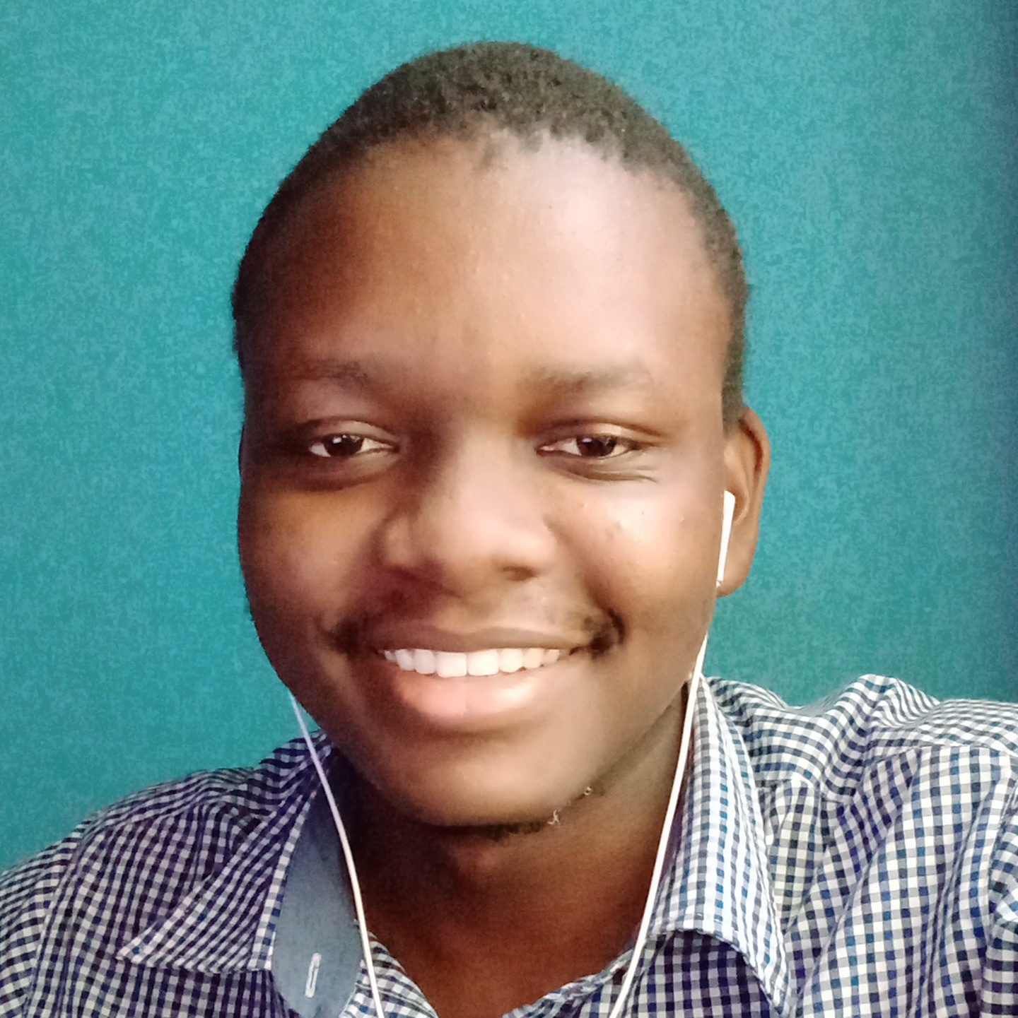
Thomas Sankara
I am inevitable a Front-end Web Developer
Try to resize your browser window to see how the profile card resizes to fit on mobile and on desktop.
Step 1: Create your workspace.
Create a new folder wherever you want on your machine. You can call it Profile Card because that is what we are creating. Open up the folder in your favorite code editor, which for me, is Visual Studio Code.
Step 2: Create the HTML.
In your workspace, create a new file called index.html and add in the following code:
<!DOCTYPE html>
<html lang="en">
  <head>
    <meta charset="UTF-8" />
    <meta name="viewport" content="width=device-width, initial-scale=1.0" />
    <title>Profile Card</title>
  </head>
  <body>
    <section>
    <div>
    <img src="https://tsbsankara.netlify.app/static/media/portrait.f011507fb84b0bb03607.jpg" alt="Thomas Sankara Profile Card"/>
        <div>
            <h2>Thomas Sankara</h2>
        <p>I am <s>inevitable</s> a Front-end Web Developer</p>
        </div>
    </div>
</section>
  </body>
</html>
Explaining the code.
First, we have the boiler plate code which should be familiar to you: i.e. the head and meta tags.
Inside the body element, we are creating a section element which is going to be the parent (blue background) of our profile card. Inside it, we have a div element which is our actual card, containing the profile image as well as the text.
Step 3: Add CSS
Create a new file called index.css. Inside, add the following code to reset the default styles for all HTML elements:
* {
    margin: 0;
    padding: 0;
    box-sizing: border-box;
}Of course, if you try to save your work, you won’t see any change because you need to link your CSS file in your HTML. Go ahead and add the following line right before the title tag in your head element.
<!-- Other code -->
<meta name="viewport" content="width=device-width, initial-scale=1.0" />
<link href="index.css" rel="stylesheet" />
<title>Profile Card</title>
<!-- Rest of your code -->
Step 4: Run your code
Double click on the index.html file wherever it is located in your file explorer, and it will open your ugly-looking HTML, and then we can finally get to the good part.
Since it is easier to scale things up than down, we are going to build the mobile version first and then scale it up. Let’s begin by adding classnames to our HTML so that we can target the specific elements.
<section class="container">
    <div class="profile">
        <!-- Rest of code -->
    </div>
</section>
These are the only two classes we are going to need. Reload your page, nothing should change, and then we can jump into our CSS.
We have reset the styles, but the page is still looking ugly, with the image taking up too much space. Let’s fix that by adding the following code, which will force the image to take up only 100% of the container in which it is placed without overflowing.
img {
    max-width: 100%;,
    width: 80px;
    height: 80px;
    border-radius: 50%;
}
This will limit the image to 80px width and height, and adding a border radius of 50% ensures that it will be circular.
Next, let’s give the profile class a background color of white to distinguish it from the parent section element.
.profile {
    background-color: #ffffff;
}
Try reloading the webpage. We can’t see the changes to the profile class because everything currently has a background color of white. Let’s fix that. Inside the .container class, and above the .profile styles, add the following styles:
.container {
    background-image: linear-gradient(180deg, #BAD7FE, #3D83F6);
    padding: 32px;
    border-radius: 16px;
}
Now, you should be able to see the background color as well as the profile class distinctively, but still ugly looking. Let’s change the font family of the webpage. Above, the img styles, add the following:
body {
    font-family: "Arial", sans-serif;
}
Let’s also add more padding on the profile class to push the content inwards and to make it better looking:
.profile {
    background-color: #ffffff;
    padding: 32px;
    text-align: center;
}
This will add some “breathable” space between the content and the edges of your elements, as well as centering the content.
Everything is coming together nicely, but it’s still looking ugly. Let’s limit the width of the container so that it doesn’t stretch out over the entire screen, and then lets also push it inwards a bit, because it’s edges are touching the edges of the browser window.
.container {
    max-width: 700px;
    /* The margin here is to center the container */
    margin: 2rem auto;
}

.profile {
    border-radius: 16px;
}
At this point, if you wanted to leave the profile card and not style it anymore, it would be completely fine, because it is already responsive. (Mind Blown Emoji). What? Without adding any media query? It’s already responsive? Well, that’s the reason building components and websites Mobile-First is always preferrable.
For the purposes of this example, however, we are going to need to change and update the styles to get it to look like in the original design we are working with. So, let’s begin adding our media queries.
First, we need the image and the text to display side by side. We will use CSS Grid to achieve this. (You can also use CSS Flexbox). More on Grid and Flexbox in their Deep Dive Modules.
@media (min-width: 1024px) {
    .profile {
        display: grid;
        grid-template-columns: 1fr 1fr;
    }
}
Above, we are adding two grids to the profile class. The first grid is the img element, and the second grid is the div element which is the parent of the heading and paragraph.
Next, we need to resize the image so that it is no longer circular, and it takes up all the space it can in the grid in which it is located.
@media (min-width: 1024px) {
    img {
        width: 100%;
        height: 300px;
        border-radius: 0;
    }

    /* Rest of code */
}
See how the text is now located to the top, let’s bring it down to the center by adding another property on the profile class:
@media (min-width: 1024px) {
    .profile {
        display: grid;
        grid-template-columns: 1fr 1fr;
        align-items: center;
    }
}
And then let’s bring the text to the left:
@media (min-width: 1024px) {
    .profile {
        display: grid;
        grid-template-columns: 1fr 1fr;
        align-items: center;
        text-align: left;
    }
}
It’s coming together quite nicely right? Remember how we added a padding on the profile so that the content would not touch it’s edges? Now, let’s remove it so that the content touches the edges 😁.
@media (min-width: 1024px) {
    .profile {
        display: grid;
        grid-template-columns: 1fr 1fr;
        align-items: center;
        padding: 0;
        text-align: left;
    }
}
Now, we notice sometihing. Even though the profile class has a border radius around it to make it rounded on the vertices, the image doesn’t seem to respect that. Also, the image and the text are too close to one another. Let’s fix that:
@media (min-width: 1024px) {
    .profile {
        display: grid;
        grid-template-columns: 1fr 1fr;
        align-items: center;
        gap: 32px; /* Added line */
        padding: 0;
        text-align: left;
        overflow: hidden; /* Added line */
    }
}
If you don’t want to add overflow: hidden as above, you can also go inside the image and give it a rounded border on the top left and bottom left as below:
@media (min-width: 1024px) {
    img {
    border-radius: 16px 0 0 16px; /* Shorthand property*/

    /* Longhand */
    border-top-left-radius: 16px;
    border-bottom-right-radius: 16px;
}
}
And this will have the same effect. When you do this however, make sure to give the image the same border radius as the parent element so that it is uniform.
Full Code
HTML
<!DOCTYPE html>
<html lang="en">

  <head>
    <meta charset="UTF-8" />
    <meta name="viewport" content="width=device-width, initial-scale=1.0" />
    <link rel="stylesheet" href="index.css" />
    <title>Profile Card</title>
  </head>

  <body>
    <section class="container">
      <div class="profile">
        <img src="https://tsbsankara.netlify.app/static/media/portrait.f011507fb84b0bb03607.jpg" alt="Thomas Sankara Profile Card" />
        <div>
          <h2>Thomas Sankara</h2>
          <p>I am <s>inevitable</s> a Front-end Web Developer</p>
        </div>
      </div>
    </section>
  </body>

</html>
CSS
* {
  margin: 0;
  padding: 0;
  box-sizing: border-box;
}

body {
  font-family: "Arial", sans-serif;
}

img {
  max-width: 100%;
  width: 80px;
  height: 80px;
  border-radius: 50%;
}

.container {
  max-width: 700px;
  margin: 2rem auto;
  background-image: linear-gradient(180deg, #BAD7FE, #3D83F6);
  padding: 32px;
  border-radius: 16px;
}

.profile {
  background-color: #ffffff;
  padding: 32px;
  text-align: center;
  border-radius: 16px;
}

/* Media query */
@media (min-width: 1024px) {
  img {
    width: 100%;
    height: 300px;
    border-radius: 0;
  }

  .profile {
    display: grid;
    grid-template-columns: 1fr 1fr;
    align-items: center;
    gap: 32px;
    text-align: left;
    padding: 0;
    overflow: hidden;
  }
}
With just a few lines of code, you are able to achieve such an impressive design! Congratulations!
What next?
Test yourself to create new responsive designs so that you can get the feel of how media queries work. With that being said, let’s move onto the next module.